

Independent Work · New Product
Designing for One: Daily Brief
A morning app designed around time anxiety, built in a weekend, and changed through a month of daily use.
My own morning routine, especially on days when time anxiety made one appointment dominate everything around it.
The problem
The problem
I already had two tools that worked for me: a digital planner for the month and week, and a handwritten journal for whatever needed more space. What I did not have was a lightweight way to orient myself to a single day.
That gap mattered most when work or life got loud. The planner could start to feel like another thing to manage, and once I stopped opening it I lost the thread of what the day actually looked like. The journal survived those stretches because it never asked me to optimize anything. I wanted something between the two, with enough structure to show me the shape of today without creating another system I had to keep up with.
There was also a more specific constraint. My ADHD often shows up as time anxiety. If I have one appointment later in the day, I can spend the hours before it mentally counting backward instead of experiencing everything else around it. The product therefore had a narrow job: give me a short morning read that showed what was ahead without making any one obligation feel larger than the rest of the day.
Design constraint
Designing against manufactured obligation
Because I was the only user, I could start by identifying the conditions that would make me stop using the product. That led to what I called the guilt audit, which asked whether a feature created an obligation the product did not actually need.
Streaks failed that test. Overdue labels failed it. Automatically carrying yesterday's unfinished tasks into today failed it. Countdown language failed it too. The product could acknowledge difficult appointments and unfinished tasks without increasing their urgency through the interface itself.
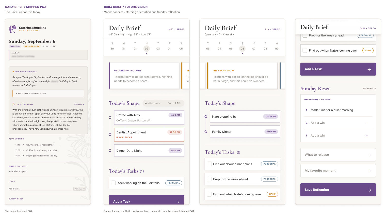
The calendar became the clearest example. Instead of telling me that an appointment was three hours away, then two, then one, the brief showed events as points across the day. A 9:30 appointment could be important while remaining one part of a larger day.
Information architecture
Designing the morning
I designed the brief as a short vertical read rather than a dashboard that expected continued attention. The order of information was part of that design.
Personal orientation came before detailed calendar information. From there, the page moved into the practical shape of the day, while sections that were useful only occasionally stayed collapsed until I wanted them. Some information belonged in the morning read every day, while material such as the fuller routine or Sunday reflection needed to remain available without asking for attention each time the page opened.
The voice had to fit the same experience. I called it the "you-after-coffee" voice: grounded, familiar, lightly coach-like, and deliberately separate from productivity cheerleading or affirmation language.
In the second version, the generated grounding thought used the season, how full the day was, and personal context as inputs. The context shaped tone and relevance without turning into a list of things the brief needed to tell me about myself.
I had also planned to pull horoscope content from an API. Once I saw it next to the rest of the experience, generic horoscope copy felt disconnected from the voice, so I replaced it with "the stars today" generated from the same contextual inputs.
The build
Building the first version
I wrote the first specification on a Friday evening and had a working version using my real Google Calendar and weather data by Saturday morning. I built the initial version inside Cowork, Claude's workspace, which let me work on the interface and use it in the same environment. That shortened the feedback loop enough for me to test the central interaction idea before putting effort into the final app container.
Once the experience was useful enough to keep opening, I converted it into an installable PWA for my iPad and Android phone so it could become part of an ordinary morning rather than something I accessed through a chat workspace.
Calendar logic
Making the day accurate
The first calendar model excluded work because I wanted the brief to remain a personal space. Using it on normal workdays exposed the problem: a Monday could contain a full day of meetings while the brief described the day as open because my personal calendar happened to be empty.
Daily use showed that calendar source alone was the wrong classification. What mattered was the role each calendar played in my day.
Personal events could appear normally and contribute to the shape of the day. My partner's events could appear with clear attribution without becoming my tasks. Work blocks could affect whether the day was light or full without filling the personal timeline. Together, those rules gave the brief enough context to describe the day accurately while keeping work contained.
Real use
What daily use changed
I used the brief daily for roughly a month, and several decisions changed only after I encountered them in the morning routine they were meant to support. I swapped the calendar and morning-rhythm sections after seeing the original order in context, and I moved the Sunday reset back to Sunday because showing reflection prompts on Saturday evening made them feel like something I was already late doing.
I also changed to-dos so they cleared with each new day instead of automatically carrying unfinished items forward. Carry-forward behavior is common in task products, but here it recreated the accumulated obligation the guilt audit was meant to prevent.
The calendar model changed through the same process. The first version kept work out of the personal space, but that also made the brief inaccurate on workdays. Regular use made the tradeoff visible in a way the initial specification had not.
During that month, the brief became the first tool I opened in the morning. It did not replace the planner or the journal. It filled the smaller orientation gap between them.
Cross-device iteration
What broke across devices
Using the same PWA on an iPad and an Android phone exposed assumptions I could not see while building in one environment. The clearest example was adding a to-do: on the iPad, typing a task and pressing Return saved it, while on Android the same apparent action did nothing.
The original implementation listened for an Enter keystroke. That matched the hardware keyboard behavior I had been testing, while Android's soft keyboard could express the same user intent differently. I changed the interaction so saving no longer depended on one specific signal. Hardware Enter, form submission, an inserted line-break fallback, and tapping the arrow could all lead to the same save action.
A second issue initially looked like the same bug. I thought the Sunday-reset fields were failing to save on the phone, but they were already saving on every keystroke.
The data was saving correctly; the interface simply gave me no visible confirmation. Pressing Return and seeing nothing happen made a working interaction feel broken. I added a small saved confirmation near the heading and left the persistence logic alone, because changing the save mechanism would have addressed a problem that was not actually present.
Those two issues changed how I checked the product for assumptions about its environment, including keyboard behavior, device input, connectivity, and whether changes in system state were visible enough to trust.
Reflections
Reflections
Starting with the emotional constraint gave me a practical way to make product decisions before I had a feature list. The guilt audit was useful because it was specific enough to reject otherwise normal patterns when they worked against the reason I was building the product.
The month of daily use mattered for a different reason. Several changes were small, but they only became obvious when the brief was part of an actual morning rather than something I was evaluating in isolation.
The cross-device problems added another layer. Designing for one person simplified the feedback loop, but it did not eliminate the variation introduced by different devices and interaction models. The product became more reliable once I stopped treating the environment I had built it in as the only environment it needed to handle.